{Susan Allibone Project} Help me decide on chapter pages!
We are up to chapter 21 of 26! Can you help me by reading the chapter and noting any typos for me? I’ve uploaded it onto Google Docs here.
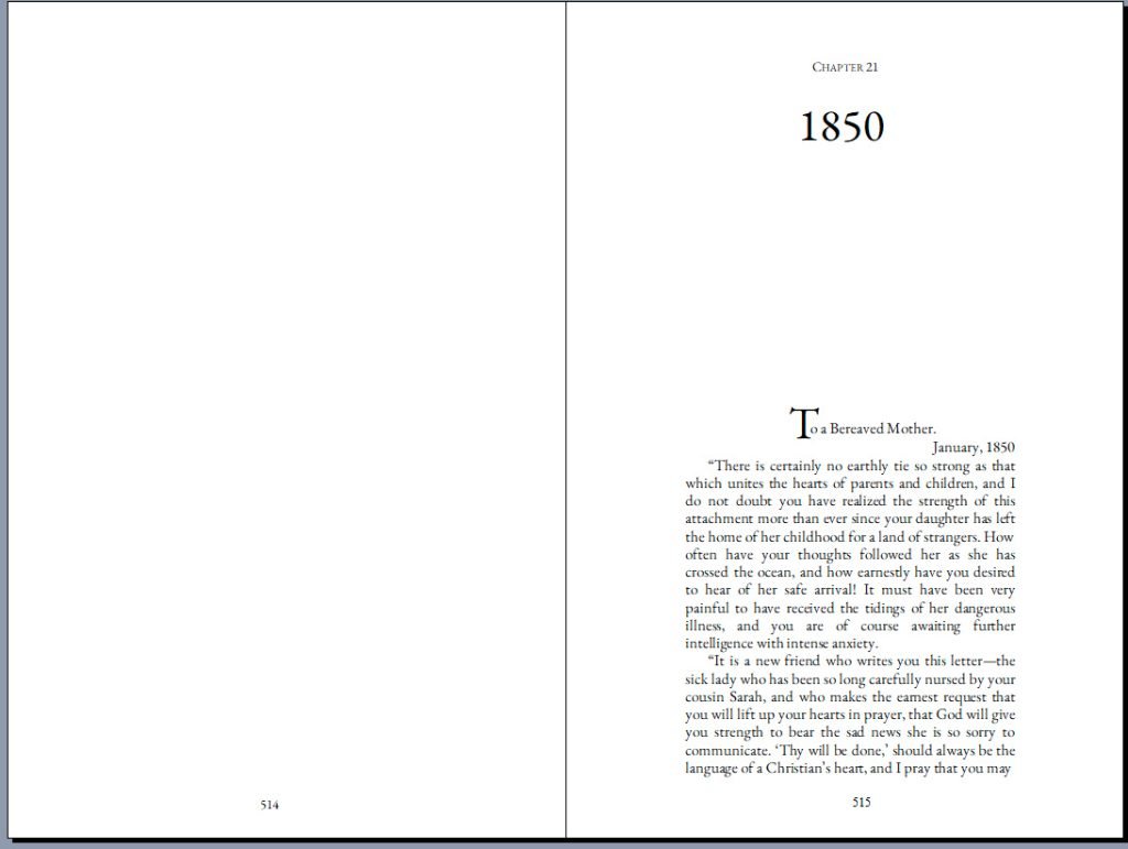
ALSO! I need your opinion on the chapter title pages! So far, as I’m formatting each page in the book, I’ve left the first page of every chapter pretty clean and simple. But I’m wondering, does it need a little more? I want you to help me decide. Here are your options:
Option 1. Plain, clean, simple:
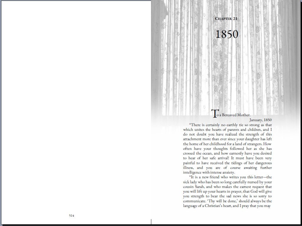
Or, option 2.
(I chose curtains for the background because for most of this memoir Susan was confined to her room. For over a decade she lived a very full life there, so I thought the lace curtains and the window frame was very fitting.) Option 2 has the curtains fading into the text.
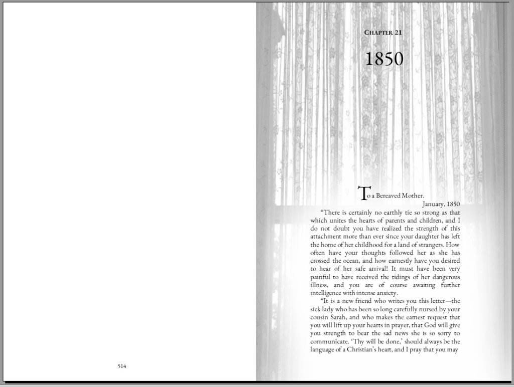
Or, option 3. This has the curtains fading around the text. (It’s not completely even because the left side will be in the gutter of the book.)
I’d love to hear your thoughts! Click over to the simple poll to vote (and see bigger pictures).
Click here for the poll
Click here to help proofread
Thank you so much for all your help!


#1. This picture doesn’t work here. Instead of framing and highlighting the text, it just makes the whole page look gray. Not enough contrast. Also, I thought it was a picture of trees, until I saw that you called it a curtain.