
{Susan Allibone Project} Cover Reveal! + proofreading chapter 22
We are up to chapter 22 of 26! Can you help me by reading the chapter and noting any typos for me? I’ve uploaded it onto Google Docs here.
ALSO! It’s time for the COVER reveal! I’m so excited to share it with you!
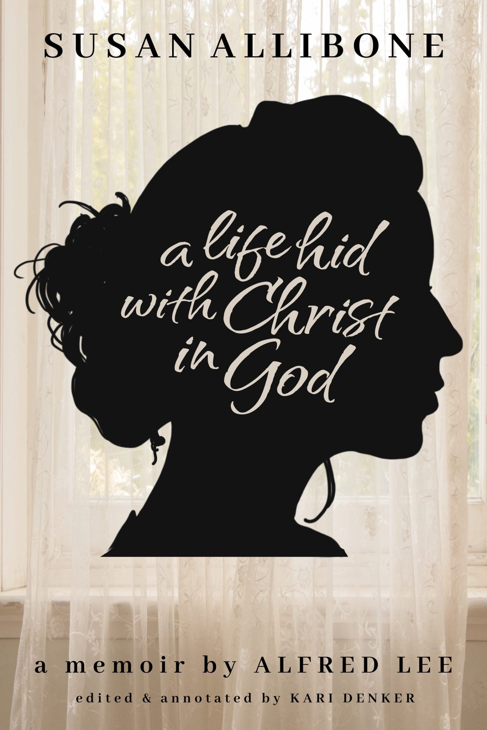
Why this design?
Susan spent almost the entire last 20 years of her life confined to her room. In that room, she lived a fuller life than most believers who had full health. She was regularly visited by statesmen, missionaries, pastors, and community members seeking wisdom, encouragement, or prayer. So, therefore I wanted the background of the cover represent that. I was imagining what the view from her bed would have been, that of a sunny window diffused by airy curtains. I wanted the color to be in light sepia tones, to hopefully represent that it’s a older memoir. There is no picture of Susan anywhere online that I can find, so I decided to sketch a silhouette (since most memoirs almost all have a picture of the subject on the cover).
As it stands right now, the cover just has her name at the top, and the original title given to it in 1856. I can add a subtitle, but am unsure if I should.
Here are my questions to you today:
1. Do you like this cover? Any suggestions?
2. Would you pick this book up off a bookshelf in a bookstore?
3. Would it help to have a subtitle of some sort? If so, any thoughts on what it would be?
Leave your comments below!
Thank you guys again SO MUCH! I can’t wait to share this amazing book with you! Don’t forget to help me proofread by clicking below. Even if you haven’t helped up to this point, you can click over and start with just this chapter! THANK YOU!!
Click here to help proofread.
Thank you so much for all your help!


I love it! I can’t think of anything that I would change about.
Beautiful! I think it is perfect. Yes, I would pick this up in a bookstore. Thanks for sharing.
I would make the silhouette a little smaller. it is too heavy for the soft background. Making it smaller will balance it out.
I agree with Debbie. I also wonder what the silhouette would look like in a soft dark brown and the title and author’s name in a dark brown.
I wouldn’t change a thing! Except maybe proper capitalization through out–my personal preference.
Yes, I’d pick it up in a book store, the silhouette and hand-lettered/brush stroke look definitely appeals to me.
I think the cover says it all, unless there is a specific focus that would necessitate a subtitle?
Very appealing- I like the contrast very much, and the silhouette is graceful and evocative. The curtained window is subtle and helps tell a story. I would take a look at it on a bookshelf. Some possible suggestions to consider: -1) might it be interesting to see the same cover but with the silhouette flipped so she is facing left and the writing goes into the hair rather than toward the face/features? Or even tilt the face so she’s looking slightly down. -2) maybe play with fonts and sizes a bit more. I like the script on the silhouette, but my eyes went to it first rather than to the title. And I think you’ve used just two fonts, but they are all in different sizes so it looks like a lot of fonts. I don’t think any further subtitle is needed. Nicely done!
I like it! You obviously put a lot of thought and work into the cover design. The window and sheer curtains are a lovely touch. My only suggestion might be to move the silhouette down a bit.
I would love a subtitle! Something like “life & faith in [the year, like 1850] for a woman confined to her room”
or
” a strong Christian woman in [1850]”
Absolutely beautiful graphics! I love the cover!
All that I would change is proper capitalization. Well done!
From a design perspective, something is throwing my eyes off. I see the sharp line of the end of the silhouette and then the line of the window sill. Maybe move the silhouette down to align it, or soften the color of the silhouette.
The above thoughts are obviously just being nit-picky, I do like to concept you are going for. Best of luck!